The changing of the leaves
has us daydreaming over new home hues. From jewel tones to oversaturated
oranges, autumnal tones bring a burst of drama and natural allure to
any space. As interior revamps go, switching up paint colors via a bold
accent wall or fullblown makeover is a cost-effective and wildly
transformative design project. You’ll definitely get plenty of bang for
your buck.
To give you
some seasonal inspiration, we’ve honed in our very top shades for fall.
We’re currently craving lush, subdued neutrals and ephemeral shades
that echo the raw beauty of the great outdoors. Paired with chic and
artful accessories, these undeniably alluring hues are at the top of our
must list for bringing any space up to the moment. Capitalize on the
crisp, clean weather, and get your home completely turned out in time to
welcome in the holidays. Now’s the time to feather your nest. Winter is
coming.
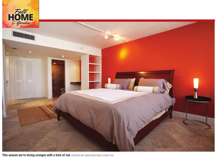
Blood orange This
season we’re loving oranges with a kick of red. When painting with
brights, sample multiple swatches. Natural light and square footage will
make a major impact on the overall aesthetic.
Petrol blue One of our favorite online vintage sources, 1stdibs, first alerted us
to this particular shade of azure. The dusty and dramatic blue is
elegant and striking without ever veering into melodrama. The sublimely
subtle hue is entirely handsome.
Concrete gray We’ve been really feeling concrete this year.
The
pared-down architectural vibe of the raw material lends a structured
precision and raw, dynamic appeal to modern accessories and furniture.
Light gray channels soothing, tranquil notes that feel consistently
edited and poised.
Terra cotta One
Fine Stay’s Via Zara in northern Rome is the stuff dreams and passport
stamps are made of. Nod to the crisp fall weather by bringing natural,
outdoor-centric hues indoors. We especially love the soulful and
unexpected combination of earthy terra cotta with lustrous teal.
Ash blond Neutrals
are eternal. The poise and restraint of the perfect blond is
perennially chic and undeniably timeless. This season, we’re all about
subtle tan shades on the cooler side of the spectrum. It’s beige with a
side of dusty, overcast appeal.
Emerald city green Ever since Gwyneth Paltrow breezed on screen in Alfonso Cuaron’s Great Expectations in
1998, we’ve been swooning over emerald green as the official color
mascot of fall. Studio McGee’s Claybourne Project is a master class in
jewel tone chic. Pairing crisp whites with dimensional marble and pops
of greenery, the adept blend of deep hue and edited, modern
embellishments is intelligent and museworthy.
Matte black Black doesn’t have to be serious and moody.
Matte
black walls evoke iconic high-contrast appeal while still keeping the
vibe exuberant and relaxed. This season, we’re making a strong case for
adding in a dose of dark art cool.
Chalk white Are we ever going to get over the all-white
space aesthetic? No. We’ll never let go. If you share in our affinity
for pure white abodes (the serene sophistication, the unfettered
glamour, the bright calm...) feel free to wax poetic along with us via a
fresh coat of chalk white paint. It remains the ultimate refresh.
Get
the latest on home decor trends, design ideas, shopping guides and food
news, and take a look inside your favorite celebrity homes on
DomaineHome.com.
