“Too much of anything is too much!”
RECLAIMED ROOMS
 I gotta tell ya, folks, I struggled on what topic to write about in this first article and issue of 2017. It has been a tumultuous and divisive time for a lot of folks out there, but we must play the cards we’ve been dealt. Let’s all try to move forward with a positive attitude, hope/pray for the best and get back to what matters most in life: family, respecting others, being an asset to your community, helping those in need and of course, good design.
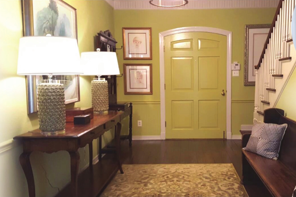
I’ve researched several “lifestyle” sites along with our own insight and have compiled a comprehensive What’s “In/Out” list for 2017. All the pics are rooms we, Space: interiors, designed in 2016.
IN Green: either bright greens like granny apple/chartreuse or its richer cousins, emerald/hunter. Green is the color of life and prosperity; think “spring” or “money.”
Faux Finishes: We are not talking about marbling or ragging but using materials (wallpaper, flooring) which mimic other surfaces (wood, stone, etc.). It’s very effective and usually costs less.
Raw White: This means the white is in a matte or bisque finish and not “pure” white but more off-white, like alabaster or bone.
Navy: I have always loved blue and especially navy. It has a moody, rich tone to it and looks amazing with antiqued brass, golds and white.
Texture: Every room we design is filled with a wide variety of texture: fur, linens, silks, metals, woods. This helps give your rooms a layered look.
Mixed
Patterns: There are essentially two schools of thought on this: a
purposeful mismatching to give a room a fun, funky, “eclectic” vibe or
unifying them with color or similar, but not identical, pattern. The
latter gives your room a cohesive vibe without being matchy-matchy.
OUT Using
a singular “style” for your rooms. A room filled with matching sets of
furniture, antiques, mid-century items, etc., cause it to look forced or
contrived. Rooms with varying styles make them look collected and not
just purchased. It gives them depth and keeps the eye moving around
because everything is NOT the same. It’s all about the MIX!
Oversized
Furniture: We see this a lot! Mostly in big ol’ brown leather sofas.
Properly scaled furniture and lighting is the pinnacle in spatial
planning and maximum use of your room.
The Overuse of Brown and Beige: This one has plagued our area far too long now. There is a time and
place for using these colors, but certainly not together. We have been
in several homes where everything is some variation of these colors –
walls, floors, cabinets, furniture, accessories, etc.; it’s depressing.
It’s time to lighten up, folks. Brown and white/cream look great
together!
Here is a
simple mantra for y’all out there thinking of making some interior
changes this year. Too much of anything is too much! Happy 2017 from
Space: interiors.
Myron Griffing is the owner of Space: interiors. Contact him at 464-6254.


