
Violet
verbena, with its grayed-off, moody purple, is both elegant and
calming. Lighting and other colors it is combined with will reveal
different nuances to the paint shade. According to PPG, it is a great
color for an accent wall, and it has a lot of versatility.
“Violet verbena
was unanimously selected as the 2017 Color of the Year by PPG’s global
color experts for its distinctive qualities. We are seeing this shade of
violet on the runway in fashion, and in textiles for the commercial and
residential segments,” said Dee Schlotter, PPG Paints senior color
marketing manager. “Consumers now embrace the middle ground between
masculine and feminine, young and old, and work and leisure. Violet
verbena’s blending of gray and violet reflects that middle ground.”
PPG
has more than 20 color stylists around the world, each specializing in
different industries including architectural, automotive, aerospace and
consumer electronics. Schlotter said they gather each year to analyze
trends to determine which colors will appeal and represent the PPG
global color forecast for the following year, including PPG’s Color of
the Year.
Locally,
PPG Paints’ violet verbena can be found at any of the three Caddo Paint
locations. Alandia Pinchera, Caddo Paint wall covering manager, has
worked at the family-owned business for 25 years and works to help
customers select the best color choices to make their space unique.
Pinchera says she determines whether a customer is trying to coordinate
their paint color with fabric or furniture pieces, and then helps them
match the best shade.
“If
they have a fabric, it’s a really good guide to go by. A lot of times,
if I lay the color strips on their fabrics, you can either see all these
colors are going to work, or none of these
colors are going to work,” she said. “You’ll find that there are so many
shades of colors, sometimes the choices get overwhelming … and we just
try to help them pick it out.”
Pinchera
said customers bring in many different types of materials in their
search for wall colors, including tiles and granites, in addition to
fabrics.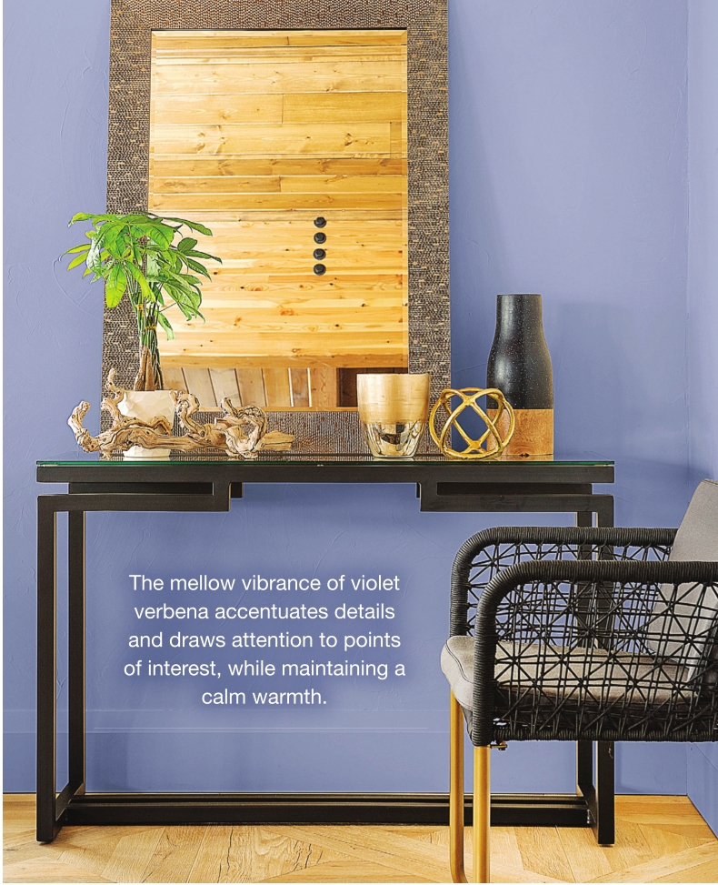
She
said the best advice she gives customers is to purchase a sample can of
paint before committing fully to a color choice. She says painting a
part of a wall or a piece of poster board will reveal how the color will
look in the home.
“The
lighting in everyone’s home affects how the color is going to look in
that room. You might have a color you think is perfect, and you get it
home in your lighting and it doesn’t look right,” she said. “A sample
can of paint is well worth the expense.”
For
PPG Paints, developing color trends is a global effort that takes
different cultures into consideration. The company believes color
reflects cultural changes and sociological shifts. Violet verbena is the
focal point of PPG’s four global color trend stories for 2017. The
color trends focus on the elemental themes of earth, air, fire and
water. The trend themes are Hour Glass, ES/Sence, IMpower and
Biocentric.
Hour
Glass represents earth. Rich hues were created to pair with wood,
marble and stone tile. The lavender hues of violet verbena blend with
greens, blues and neutrals. ES/Sence focuses on the purity of water and
that less is more. The palette was created to evoke a sense of
simplicity and calm with watery blues and lush greens. Impower
represents the element of fire. It features deep tones to light
neutrals. Air is represented by the Biocentric theme. The palette
showcases space-inspired shades to show that everything is connected.
“Consumers
are drawn to the galactic dark colors that combine deep purples, blues
and grays to create an intriguing futuristic vibe,” Schlotter said.
Pinchera
says shades of gray are very popular right now, and it is an adaptable
color. “You can get a gray that turns blue, some turn lavender, some
turn green, some turn tan. It’s just amazing what lighting will do to
the color choices.”
PPG
Paints’ 2017 Color of the Year is a unique violet hue with a quality
that allows it to adapt to surrounding environments. According to
Scholtter, the color unveils gray undertones when paired with dark
neutrals, but reads as a purer purple when paired with whites.
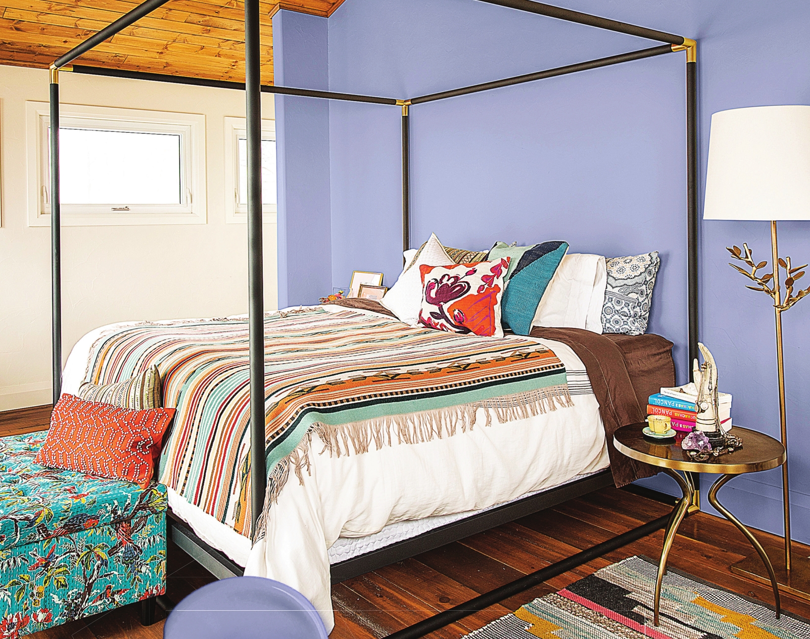
“Violet
verbena blends perfectly with many different surroundings. It looks
polished yet playful in a child’s room, and it is calming enough to be
used in hospitals or other spaces that require tranquility,” she said.
PPG
Paints boats more than 2,000 colors in its available paint hues.
Schlotter says PPG Paints is already looking ahead to colors that will
be prominent in 2018. 2016’s Color of the Year was Paradise Found, a
shade of aloe green.
